A tour of the widget from your visitor's side, from the launcher and home screen to each tab and how it looks on a phone.
5 min readUpdated 20 days ago
Once the script is on your site, every visitor gets a launcher in the corner of the page. Selecting it opens the widget, where they can report a bug, share an idea, chat with you, read your changelog and roadmap, and search your help articles.
The preview on the Widget page shows the same widget with your current settings. Open Publish, then Widget, to see it.
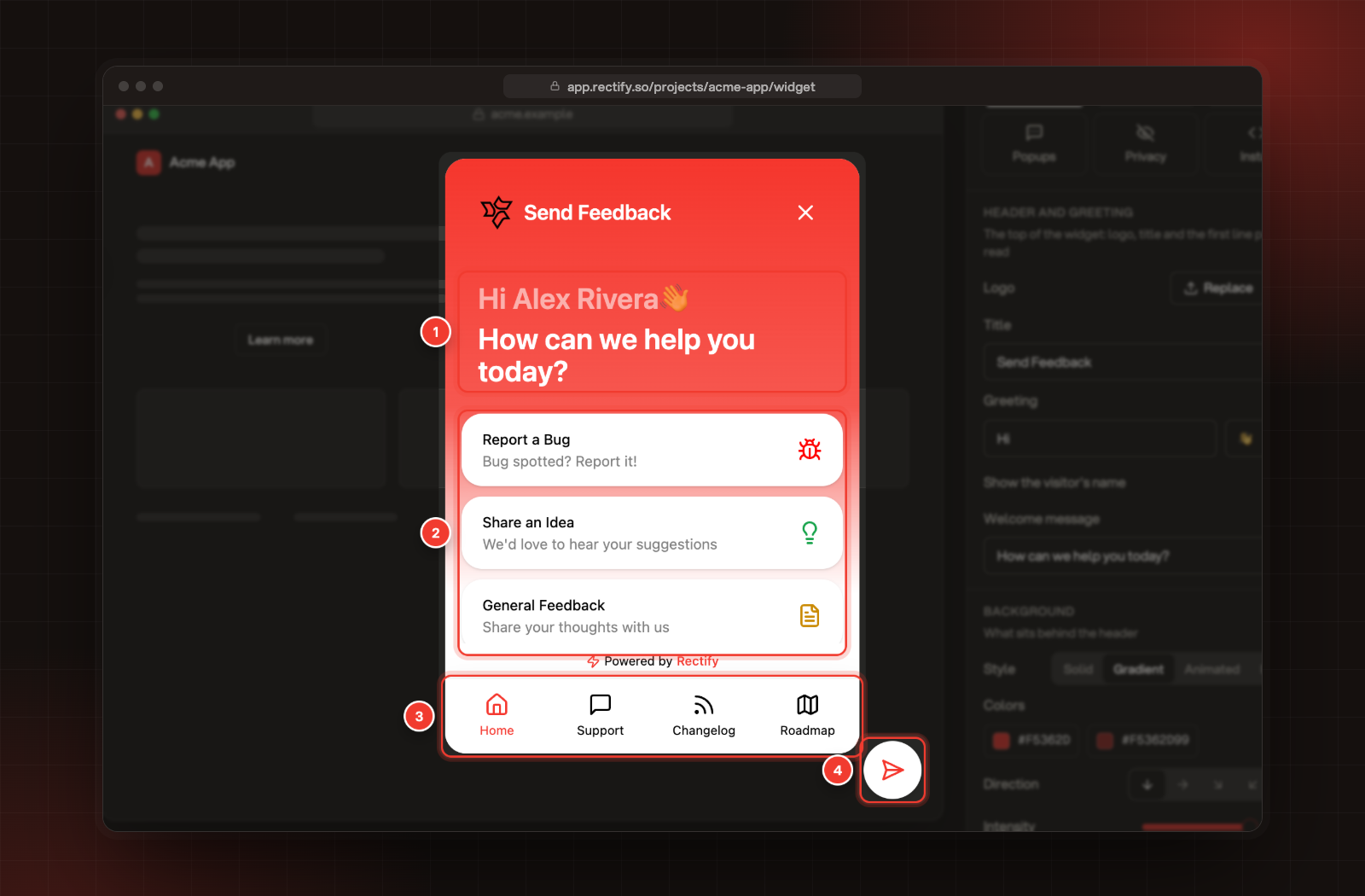
1 Greeting. 2 Home menu cards. 3 Tabs. 4 Launcher.
The launcher
The launcher is the button that opens and closes the widget. It sits bottom right unless you move it. Visitors can drag it somewhere else on the page, and their browser remembers the spot until you change the launcher's Position.
Two small signs show on it:
•
A dot when one of your team or Quanta has replied in a conversation. New replies also play a sound and add the number of unread replies to the browser tab's title.
•
A red dot when there's a changelog entry the visitor hasn't seen yet.
The home screen
The widget opens on the home screen. If you've turned Home off, it opens on the first tab that is on instead, and your script can also open it on a tab of your choice. The home screen has:
•
The header with your logo, the widget title and a close button. If you show your team on the home screen, up to three of their photos appear here too.
•
The greeting, for example "Hi Jane" with a wave, and a welcome line under it. The visitor's name only appears when your site tells the widget who they are.
•
The home menu cards. By default these are Report a Bug, Share an Idea and General Feedback. Each opens its own short form. You can also add Share Your Experience, a link to your own contact page, a card that opens your help articles, and Chat with us, the Support card, which starts a conversation with you. If no card is on, visitors see only the greeting.
•
Powered by Rectify at the bottom, unless you've hidden it.
•
The tabs along the bottom, when two or more are on.
The tabs
Tab
What visitors do there
Home
Pick a card to send feedback, open a link or start a chat.
Support
Start a conversation and see past ones. Quanta or your team answers, depending on your Support settings. The first time, visitors enter their name and email and select Continue.
Changelog
Read what you've shipped, filter by label and open an entry. Signed-in visitors with an email can select Subscribe to get new releases by email.
Roadmap
See your public roadmap under Roadmap, and browse, vote on and post ideas under Requests.
Help
Search your help articles, open them in the widget and, if it's on, ask Quanta a question.
Home, Support, Changelog and Roadmap are on when you start. Help is off until you turn it on. Choose the widget's tabs shows how to change them.
The tab bar only shows when two or more tabs are on. Two or three tabs sit together in the middle, and four or more spread across it. The bar is also hidden in the Home and support and Support only layouts, see Choose the widget's layout. Without the bar, the Support, Changelog, Roadmap and Help screens show a back arrow to Home.
Popups and what's new
The widget can also speak first. A popup message can appear beside the launcher before anyone opens it, see Show popup messages. If you turn on Open when something shipped for the Changelog tab, returning visitors see your newest entry in a What's new card with Later and Read more.
Signed-in visitors and anonymous visitors
When your site tells the widget who is signed in, the widget greets them by name and fills in their name and email in the feedback forms and in Support. They also show up in your contacts.
To vote, post and comment as themselves in the Roadmap, Changelog and Help tabs, they need to be signed in with a signature from your server. Without it, they use those tabs anonymously, as far as your portal settings allow. Where your portal only allows signed-in members, the widget says so, for example "Only signed-in members can vote here." Sign in verified users explains both steps.
On a phone
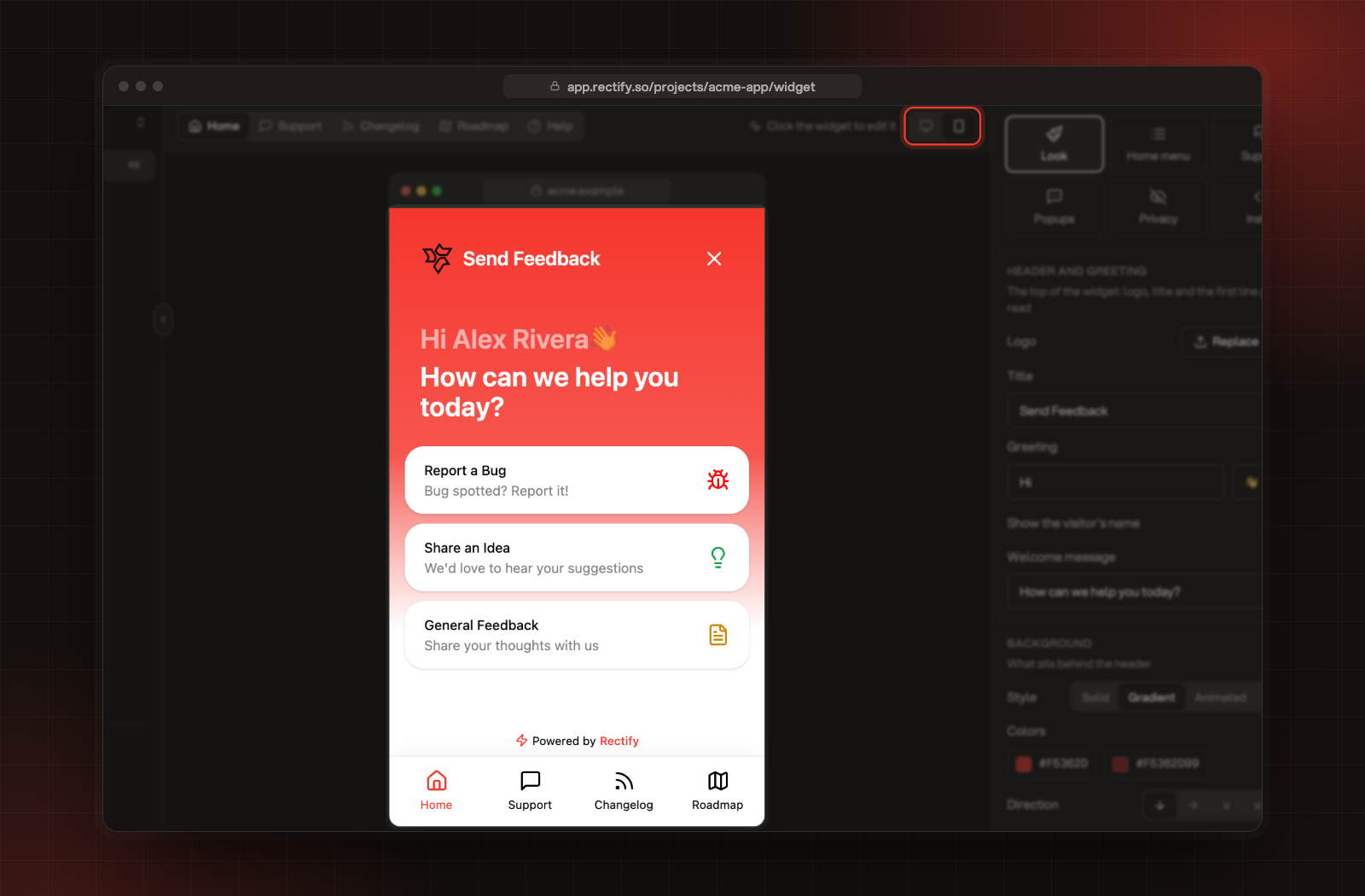
On a screen 640 pixels wide or narrower, the widget fills the whole screen when it's open. On larger screens it opens as a panel next to the launcher. In the preview, select the phone icon at the top to see the phone layout.
The phone preview of the widget.
Powered by Rectify
The widget shows Powered by Rectify at the bottom of every screen. On the Launch, Accelerate and Enterprise plans you can hide it under Look, in Powered by. See Compare plans and what each one includes.