Change the widget's header, greeting, background, colours and corners, and choose how the launcher looks and where it sits.
5 min readUpdated 5 days ago
Before you start. Owners, Admins and Members can change the widget. Hiding Powered by Rectify needs the Launch plan or higher.
Everything about how the widget looks is under Look on the Widget page. The preview on the left changes as you go, and nothing reaches your site until you save.
Change the look
1.
In your project, open Publish, then Widget. Look opens first.
2.
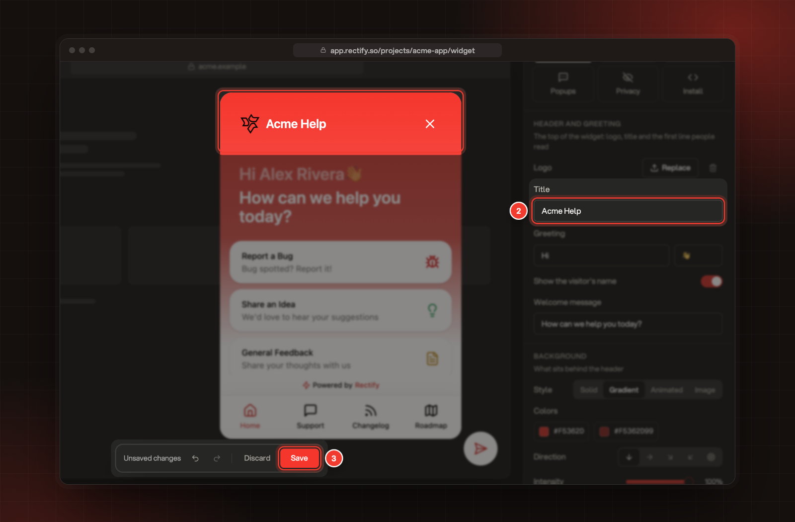
Change a setting, for example the Title. The preview updates straight away. To find a setting fast, click that part of the preview.
3.
Select Save in the bar at the bottom.
2 Title, under Header and greeting. 3 Save.
The bar also has Discard to throw away your changes, and undo and redo buttons. Ctrl or Cmd Z undoes too. Select Guide at the top of the page to show a line of help under every setting.
Header and greeting
Setting
What it does
Logo
Shown beside the title. Upload your own (JPEG, PNG or GIF up to 10 MB), select Use project logo or Use default, or remove it.
Title
The name next to the logo. It starts as "Send Feedback".
Greeting
The first big line. The two boxes wrap around the visitor's name, "Hi" and a wave to start.
Show the visitor's name
Puts the visitor's name between the two greeting boxes when your site tells the widget who they are.
Welcome message
The line under the greeting. It starts as "How can we help you today?".
Background
The background sits behind the header and greeting. Pick a Style:
•
Solid: one colour.
•
Gradient: a Start and End colour, a Direction, the Intensity of the blend and the Midpoint where the colours meet. Edge sets whether the bottom fades into the panel or stops sharply. This is the style you start with.
•
Animated: a moving Pattern (Ripple, Waves, Aurora, Flow, Sparkle or Bubbles) in a Palette of five colours. Turn Animate off to keep it still.
•
Image: your own picture, with Blur from 0 to 20 px. Select Use default for ours.
Height sets how far down the panel the background reaches, from 30% to 100%. It always covers the greeting. Height isn't available for Animated.
Colours and corners
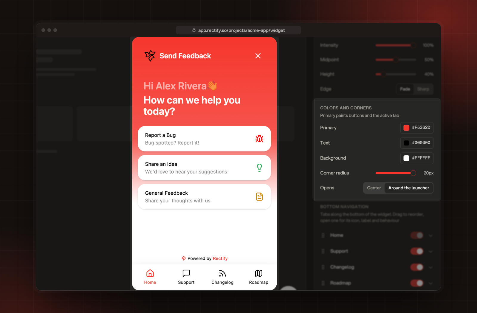
Colors and corners, with the preview beside it.
Setting
What it colours
Primary
Buttons, links, the active tab and the header of every screen after Home.
Text
The titles and descriptions on the home menu cards, and the tabs.
Background
The home menu cards and the tab bar.
Corner radius
How round the widget and its cards are, up to 20 px.
Opens
Where the panel appears: Around the launcher or in the Center of the page.
Your project's brand colour is used for Primary, the background and the launcher icon when the project is created.
The launcher
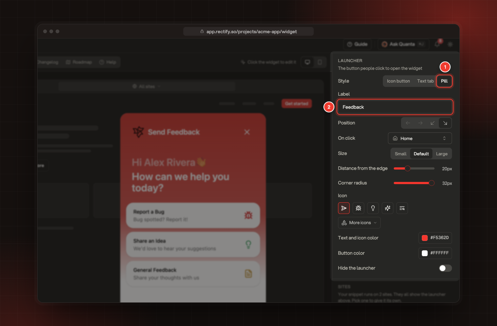
1 Pill, a launcher style. 2 Label, the text on it.
Setting
What it does
Style
Icon button (a round button), Text tab (a tab on the edge of the page) or Pill (an icon with a word).
Label
The text on a Text tab or Pill, up to 24 characters. It starts as "Feedback".
Position
Middle left, middle right, bottom left or bottom right. A Pill always sits in a bottom corner.
On click
What opens when someone clicks the launcher: a tab, or a feedback form such as Share an Idea. Until you change it, a click opens the widget on its opening tab.
Size
Small, Default or Large. Not for a Text tab.
Distance from the edge
0 to 64 px between the button and the screen edge. Not for a Text tab.
Corner radius
From square corners (0) to fully round (32 px).
Text only
For a Text tab: drop the icon and show just the label.
Icon
One of five presets, or select More icons to search for any icon.
These settings apply on every site that runs your snippet. To give one site, or some of its pages, a different launcher, see Give a site or page its own launcher.
Powered by Rectify
Under Powered by, choose Keep or Hide for Powered by Rectify. On a plan below Launch, choosing Hide opens the upgrade screen instead. See Compare plans and what each one includes.
Check it worked
After you select Save, open your site in a new tab and refresh it. The launcher and the widget show your new look.
Troubleshooting
I can't pick a middle position
The Pill launcher only sits in a bottom corner, so the middle positions are greyed out. Choose Icon button or Text tab to use them.
It says "Pick an image under 10 MB"
Logos and background images can be up to 10 MB, in JPEG, PNG or GIF. Make the image smaller and upload it again.
The launcher sits somewhere else on my site
You, or a visitor, dragged it there. The browser remembers the spot until you change the Position setting. Clear the site's data in your browser to put it back.
It says "Leave without saving?"
You changed something and haven't saved. Select Keep editing, then Save, or select Leave to drop your changes.