Choose your portal's theme, accent colour and default light or dark mode, or set your own brand colours.
3 min readUpdated 5 days ago
Before you start. Owners, Admins and Members can change the portal's look on every plan. Hiding "Powered by Rectify" needs the Launch plan or higher.
Choose a theme and accent
1.
In the sidebar, open Publish, then Portal, and open the Brand tab.
2.
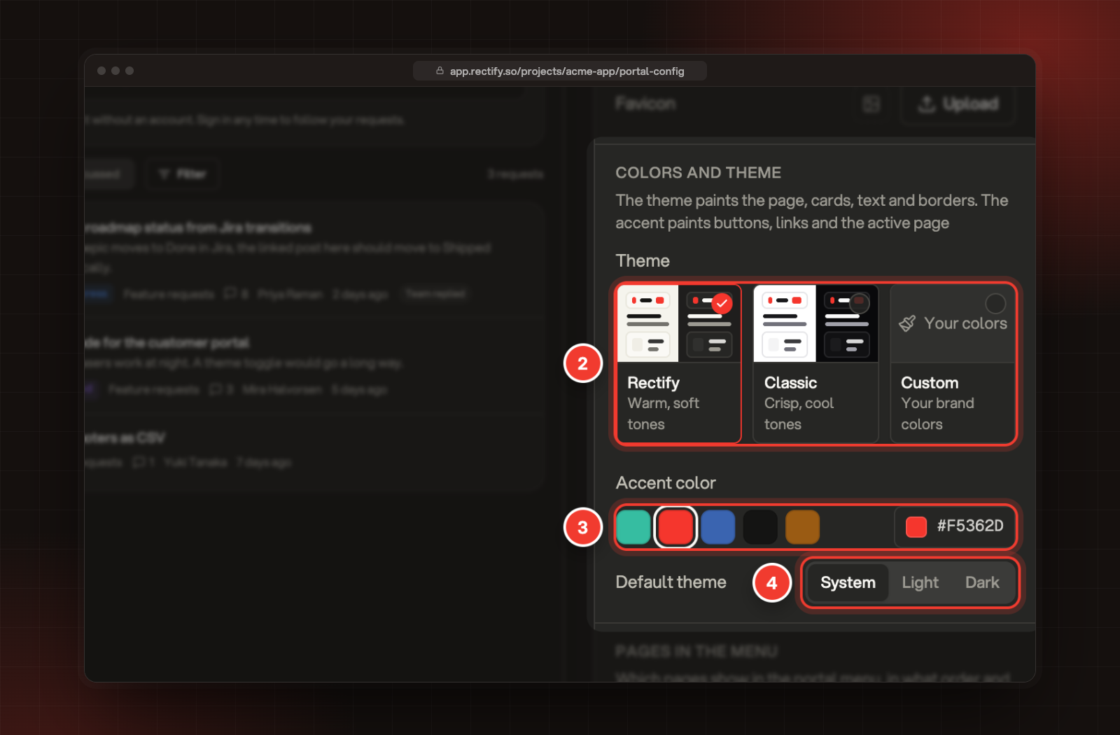
Under Colors and theme, pick a Theme: Rectify for warm, soft tones, Classic for crisp white and grey, or Custom for your own brand colours.
3.
Pick an Accent color. Select one of the five swatches, or select the colour box at the end of the row to pick any colour or type its hex code.
4.
Pick a Default theme: System, Light or Dark.
5.
Select Save in the bar at the bottom.
2 Theme. 3 Accent color. 4 Default theme.
The theme colours the page, cards, text and borders. The accent colours buttons, links, votes and the current page in the menu. Rectify picks white or dark text on your buttons, whichever reads better on your accent.
Default theme is the mode visitors see when they arrive. System follows their device's light or dark setting. Visitors can still switch with the sun and moon button in the portal header, and their browser remembers their choice.
The preview on the left shows your changes before you save. With System picked, the preview follows the mode you use Rectify in.
Use your own brand colours
1.
On the Brand tab, pick the Custom theme.
2.
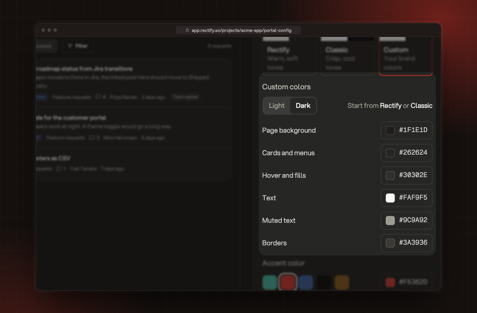
Under Custom colors, choose Light or Dark to pick which set you're editing.
3.
Set each colour: Page background, Cards and menus, Hover and fills, Text, Muted text and Borders. Select a colour box, or type a 6-digit hex code such as #1F1E1D.
4.
Switch to the other mode and set its colours too.
5.
Select Save.
Custom colors, with the Light and Dark switch and six colours.
When you first pick Custom, it starts with the colours of the theme you had. To start again from a ready-made set, select Rectify or Classic next to Start from.
Check both modes in the preview before you save. Visitors who prefer dark mode see your dark set, so keep its text easy to read on its background.
Hide "Powered by Rectify"
1.
Open the Domain and more tab.
2.
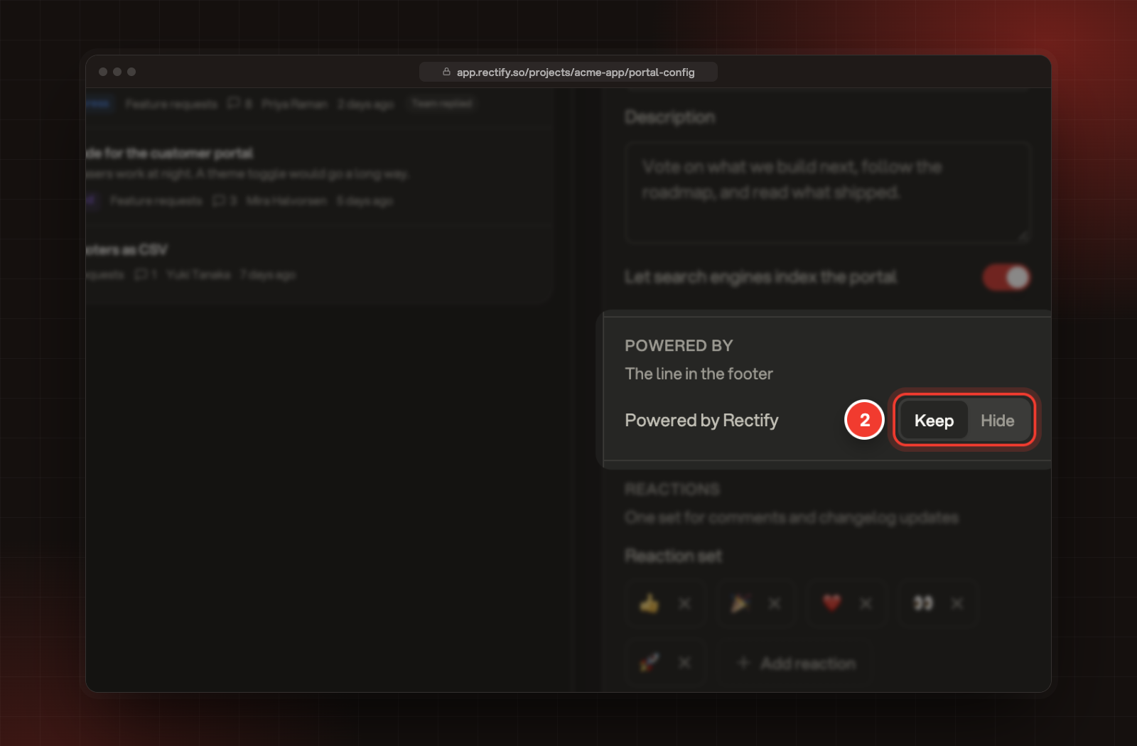
Under Powered by, select Hide next to Powered by Rectify.
3.
Select Save.
2 Keep or Hide, next to Powered by Rectify.
This removes the "Powered by Rectify" line from your portal's footer. It's included on Launch, Accelerate and Enterprise. On Idea and Build, the row shows Upgrade, and selecting Hide shows the plans that include it instead.
Check it worked
After "Portal settings saved" appears, select View portal at the top of the page. Your colours show on the portal straight away. Try the sun and moon button in the portal header to see the other mode.
It says "Use a 6-digit hex color"
Type the colour as # and six letters or numbers, such as #F5362D. Three-digit codes are expanded for you, and anything else goes back to the last colour.
The preview looks different from my portal
With System picked, the preview follows your own Rectify mode, while visitors see the mode their device uses. Use the sun and moon button on your portal to check both.